Find your way around the screen
Learn the parts of the screen once, and you know your way around the whole app.
What is on this page
Open the app with your licence code
What you see first
Before you unlock- Paste the code from your Gumroad receipt into Your licence code.
- Press Unlock.
Your beta password works in the same box until 5 November 2026.
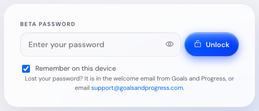
The app keeps your code in this browser, so you enter it once.
A wrong code gives a message under the field. You also get a hint when your capitals key is on.
If you cannot find your Gumroad receipt, get the code again at gumroad.com/license-key-lookup with the email you bought with.
Use the top bar
What is in the top bar
There on every screenThe top bar has four buttons: Send feedback, Save, Load and More.
A mode button, Essentials or Full, sits next to More. It goes away 14 days after you turn on Full Mode.
Next to the mark you see a beta chip and the version. Press the version for What is new, which lists what changed since your last visit.
The full changelog lists every release.

In the corner of the screen you find Saved on this device and Not backed up yet. Press it to see your options to back up your plan.
Move between the steps
What the row of steps does
There on every screenThe row under the top bar takes you through the plan: Values, Purpose, Life Areas, Vision, Summit Goals, Execute, Habits and Insights.
Strengths joins the row in Full Mode. Wall of Wins joins it after your first win.
Press a step to go there. A finished step gets a green tick, and the step you are on is filled in.


On a narrow screen the row scrolls sideways. The left and right arrow keys move you between steps while the row has the keyboard focus.
Use the bar at the bottom
What comes next
Bottom of the screenThe bar at the bottom of the screen shows what to do next, with a button that takes you there.
Before you have Summit Goals it follows your setup. After that it shows the next thing due in your rhythm.
Press Open to go to that step. When you are already there, the button is off.
When earlier steps change, a Review chip shows up on the bar. Press it for the list of steps to look at again.
Check the steps marked for review
What the amber dot means
Three places at the same timeChange your values or your life areas after later steps have content, and the app marks those later steps for review.
You see the mark in three places:
- An amber dot on the step in the row.
- A Review chip on the bar at the bottom.
- A note at the head of each marked step, with a button back to what you changed.
Nothing changes on its own. Read a marked step, close its note, and the dot goes.
Go to any screen with the keyboard
How the Jump to any screen window works
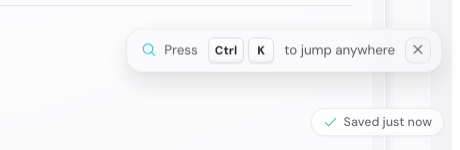
From anywhere- Press Ctrl+K or Cmd+K.
- Type a few letters of a step, such as values or habits.
- Press Enter.
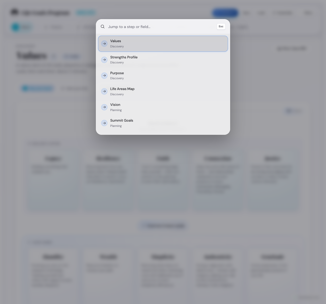
The window closes when you pick a step, and Escape closes it too.
Open the More menu
What is in the menu
Top bar, three dot button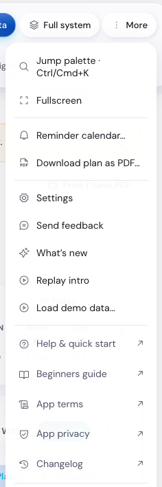
- The Do group has Jump to any screen and Fullscreen.
- The Plan and export group has Goal Cascade map, Reminder calendar and Print plan.
- The App group has Settings, About and Send feedback.
- The Help and legal group has Help, Keyboard shortcuts and What is new.
- The same group also has Replay the welcome guide, App terms and App privacy.
On a phone the More sheet shows four groups: Plan and export, Your data, App and Help and legal. Save, Load and Try the demo are in its Your data group.
See what each banner means
When each banner shows
Top of the screen- The demo banner shows while the demo runs. Press Back to my data to leave.
- The backup card shows a week after your last save file, with Save on it.
- The beta banner shows in the month before the beta ends, and asks you to keep a save file.
- The new year banner shows between 28 December and 7 January, and asks for a save file for the year.
- The storage banner shows when your plan fills the room this browser gives it.

See which windows the app opens
How a window behaves
Escape closes themA window covers the app and keeps the keyboard until you close it. Escape closes it, and so does the cross.
- The Confirm load window shows the file you picked. Press Replace my data, or Save first.
- The Settings window has six tabs, one for each kind of choice.
- The About window shows the credits and the version you are running.
- The What is new window shows what changed since your last visit.
- The Keyboard shortcuts window shows the eight keys.
- The welcome guide runs the first time you open the app. To see it again, press Replay the welcome guide.
- The Quarter check-in window shows four cards, with Save as image on it.
- The milestone window opens when you press a milestone, and you can set its status there.
See what a new plan looks like
What a step shows before you fill it
Your first daysThe app opens on Values, with the welcome guide over it. Purpose, Life Areas, Vision, Summit Goals and Execute stay grey until you finish the step before them. Habits and Insights are open from the first day.

Switch to dark mode
How to turn dark mode on
Colour themes, light or dark- Open Settings, then the Appearance tab.
- Switch Dark mode on.
Every colour theme has a dark version. Dark mode keeps the theme you picked.
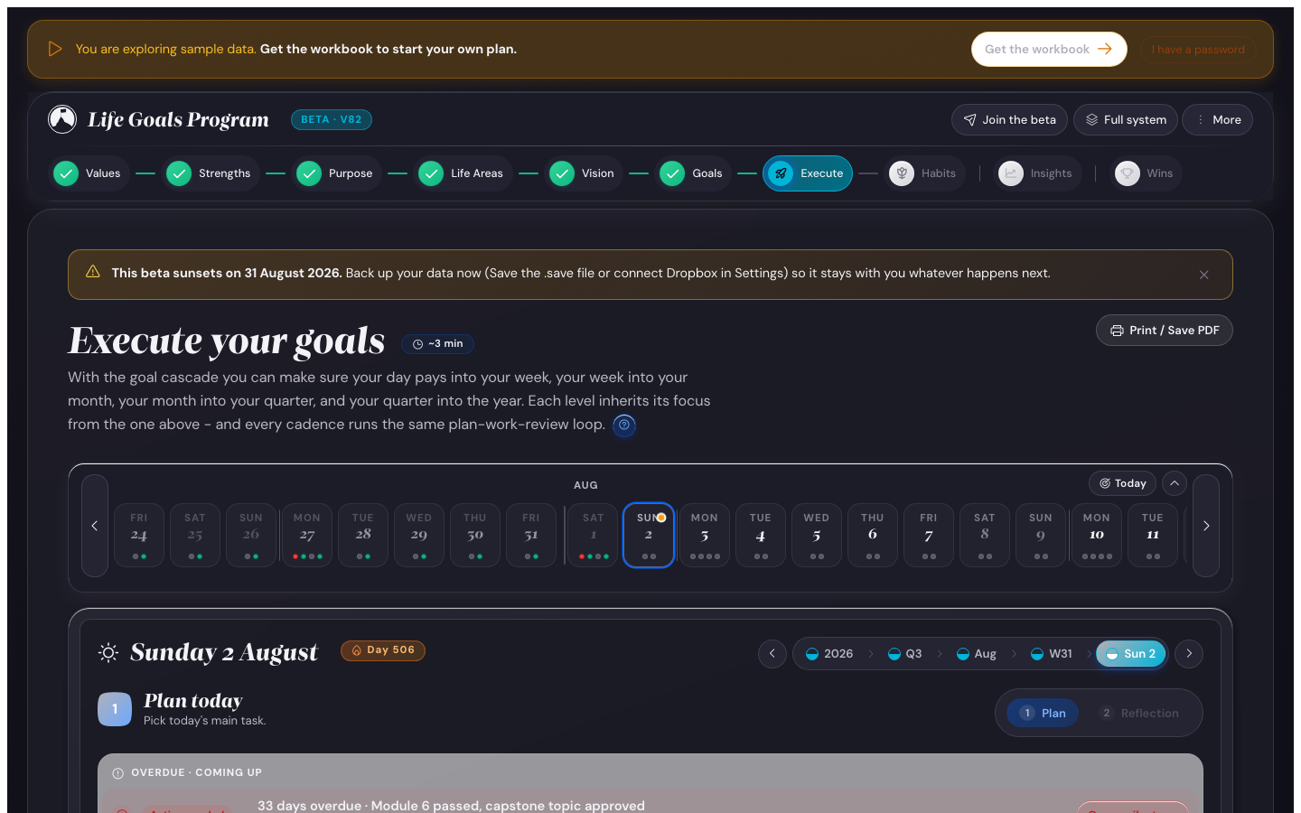
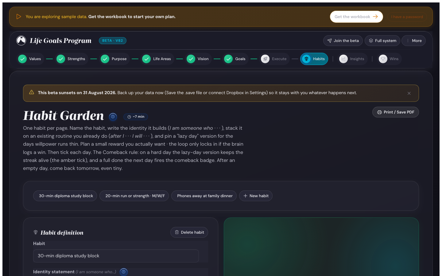
The change shows at once and stays the next time you open the app.
Print a step, or save it as a PDF
Where the print button is
Corner of every stepEach step has a small printer button in its corner. Press it and the app builds a paper layout from your data, then opens the print window.
In that window your browser can save the layout as a file instead of printing it.
- The day, week, month, quarter and year plans print as checklists.
- The Habits screen prints a year grid, one page for each habit.
- The Wall of Wins prints in date order, grouped by year.
- Your Values print as a card, with your purpose under them.
The printout is white paper with near black ink, whatever theme you use on screen.
Where to go next
- Open the ten minute quick start and try the app.
- Open the settings page to see what each setting does.
- Open the how-to answers for a single question.