What's new
This update · 29 September 2026
Since 29 September, version 1.0 (build 254).
Buttons in one style
White buttons now take the colour of your theme when you point at them or press them. The step you are on looks alike on all screens.
29 September 2026
Since 27 September, version 1.0 (build 252).
See all value cards while you play
In the Values game, See all cards shows all 28 cards while you play. Your game does not change. Each value card now has one size on all screens, with its own icon in the colour of its name. The save label keeps its words and its size. A small amber light shows while your change goes to Dropbox, then the green tick again. On the phone, the red status label takes one line. It no longer covers the last button on Home. Some messages and labels are clearer. Two long messages now show in full. In View only, a tap that would change your plan now changes nothing and says why.
Save and Load
The buttons that save your plan as a file and load it back are now called Save and Load. In the demo, these buttons are greyed out.
Even space between cards, and switched-off buttons you can read
Cards keep the same space between them. You can read the text of a switched-off button.
A line you just typed stays when you press Add
On the phone, a plan line disappeared when you pressed Add right after typing it. The line now stays.
The progress bars of your annual goals are inside the card
On the computer, you see the three small bars of an annual goal inside its card now, in line with its heading. Before, the corner of the card cut them.
27 September 2026
Since 27 September, version 1.0-beta1.245.
Choose your plan from the status label
When your Dropbox has a newer plan, the status label turns red. Press it, and a small window opens above it. Use the Dropbox plan brings that plan to this device. Keep this device's plan sends this plan to your Dropbox. The plan you do not keep goes into your Dropbox folder first. Escape or a press outside the window closes it.
27 September 2026
Since 9 September, version 1.0-beta1.244.
Saving is safer with two tabs and with a full browser storage
With two tabs on one plan, the tab that is behind no longer writes over what the other tab saved. You get a Reload button in that tab instead. The day close counts as saved only after your plan reached the browser storage. When the storage refuses a save, you get the storage line each time, not the first time only. On the phone the words Save failed are visible then.
Six small things on the phone work now
The review button in the bar opens your reflection on the phone; before, nothing happened. The day you are in no longer counts as a day still to come while it has no plan. The Execute row on Home opens from your first day, the way the Execute tab already did. A reset ends on Home instead of Settings. On Home the bar and the card point to the same next step. The day plan on the phone has a Print / Save PDF button, like the year and quarter plans.
Print and the catch-up list work on the phone
On the phone, Print / Save PDF on a day plan printed a different day than the one on screen. It prints the day you are looking at now. A review opened from the catch-up list hid the other due reviews. They show again.
Your first visit shows no update message
On the very first open, you got the message that a newer version was ready, with a Reload button. That message now shows only when a newer version has replaced the one you had.
The demo ends with a clear line and keeps your look
When you leave the demo, you read that it ended. Nothing from it stays. On the phone, the demo opens on the day screen. The demo uses the theme and the palette you chose.
The reset dialog fits the phone screen
On your phone, the line under the reset warning broke into four lines beside its box. You see it on one line over the box now.
The clock change no longer skips a reflection
Twice a year the clocks change. After the March change, the Monday counted your Sunday as less than a day ago, so your reflection for it did not come up. The app now counts calendar days, and your Sunday reflection comes up on that Monday like on every other one.
Home shows your name right after the guide
On the phone, right after the welcome guide, the Home card showed Your plan instead of your name. It showed the name only after you left Home and came back. Now it shows your name right away.
The phone settings show only what the phone has
The Appearance group on your phone ended with a line about a keyboard shortcut of the computer. The line is gone.
The Summit Goal date picker starts with the year
The date field of a Summit Goal opened on this month, odd for a goal years away. It opens on the year now: you pick the year, then the month, then the day. The other date fields open on the day as before.
A checkpoint for every remaining quarter, and two lines corrected
An annual goal drafted from your Summit Goal now gets a checkpoint at the end of every remaining quarter, the last quarter too. A checkpoint needs at least 60 days of room, so a start in November gets none. In About, the weekly reflection is about 10 minutes now. The app shows that number everywhere else too. On the Summit Goals result, the cap is three annual goals across all areas, as on the Year screen and in Settings.
Your licence code opens the app
You open the app with the code from your Gumroad receipt. One code is for one person, on your phone and your computer. The app checks the code with Gumroad every seven days and shows nothing while it is good. Your beta password keeps working until 5 November 2026. When the weekly check finds a refund, you can edit for 14 more days, then you can read your plan and download it.
Your plan can go into your Dropbox
Cloud sync is on. In Settings, under Your data, press Connect Dropbox and say yes on the Dropbox page. Your plan then goes into a folder in your Dropbox after each change. Only this app can see that folder. On a second device, press Connect Dropbox there too, and your plan comes in. Cloud sync is optional and free. When the app cannot reach Dropbox, it keeps your plan in this browser. The next save tries again.
Values opens at the start
You tapped the Values card on Home and got step 2 of 3, Rank your five. With your five in place, Values now opens step 3, Where it shows up. While you are ranking, you get the ranking.
The demo no longer follows you into your plan
After a look at the demo, Values opened at the ranking with an empty list. The demo had kept its place in that screen for you. Now you begin at Play your hand.
The empty white box above the tab bar is gone
On the phone you sometimes saw a rounded white box with nothing in it, between your screen and the tab bar. It is out of the way now.
A different draft stays in view
On the Purpose screen, Show another draft closed the section you were reading, so you had to open it again. You see the new sentence at once now.
Use this sentence takes the starter sentence
The starter sentence on the Purpose screen looked like a headline, so you could not tell you may tap it. It looks like text now, and you get a Use this sentence button with Show another draft.
Connect Dropbox keeps your name and your place
On a computer, Connect Dropbox in the welcome guide took you back to page 1 with your name gone. The app now saves your work first, so you come back where you were.
No flash of the licence screen on the way in
You saw the licence screen for about a second on each start, before your plan appeared. You go to your plan now.
Your Dropbox copy waits for your word
A plan another device put in Dropbox could get overwritten by your next save. That cannot happen now. You pull the other copy in first, or nothing goes up.
The help text waits for you
On a computer the round question mark beside a step head showed its one line of help the moment your pointer crossed it. After a trip to Dropbox it could open over your screen without a press. It waits half a second now. The keyboard still opens it straight away.
The bar under a step is one row on your phone
The back link and the next step button took a line each on your phone. You get them side by side now. The link is on the left and the button on the right. A long step title shortens instead of wrapping.
The Cloud sync card matches what happened
Right after Connect Dropbox the card still showed the line about nothing going up from this device. Your plan was going up at that moment. The card follows the upload now. It changes again when the copy is in your Dropbox.
No storage question after a restore
A plan pulled from your Dropbox brought up the question about where to keep your data, with Dropbox already connected. Connecting Dropbox is that answer. The question stays away now.
The restore window waits for you
A window about your restore opened and the page reloaded under it within a second. A restore now ends with a window titled Your plan is back. Nothing reloads until you press Open my plan.
A newer plan in your Dropbox comes to you
You had to go into Settings to find it. When this device holds nothing yet, the app brings the plan in and puts one line on screen. When you have work on this device, a card on Home gives you two buttons: Use the Dropbox plan, and Keep this device's plan. Either way the copy you do not keep goes into your Dropbox folder first. Its name is lgp-data.before and the date.
Restore is the main button on the Cloud sync card
Disconnect Dropbox was the filled button and Restore from Dropbox the quiet one. They have swapped, on your phone and on your computer.
No New habit window on a load
When the app opened on Habits with an empty garden, the New habit window stood over the screen before you had pressed anything. It opens when you press New habit.
A newer plan in your Dropbox reaches you where you are
The two buttons stood on the Home screen. They stood on the Execute step as well. A first visit does not get that far, so nothing showed there. The question now opens on the screen you are on. It stays until you pick one of the two. The small save mark at the bottom right opens the same question.
A new device brings your plan in without being asked
Connecting Dropbox from the first run question left that device with an empty plan. It now brings your plan in and says so in one line. A device counts as empty when it shows none of your values, goals or plan days. Your name and the welcome guide do not count as work. The five cards the Values screen deals when it opens do not count either. Whatever was on the device first goes into your Dropbox folder as a copy.
The Cloud sync card after your plan comes in
The card in Settings pointed you at Restore from Dropbox after the app had brought your plan in. That copy was already on your device. You now get a line that your plan came from your Dropbox.
What gets saved names your Dropbox
The window behind the save mark stated that nothing leaves your device unless you connect Dropbox. It stated that with Dropbox connected too. With Dropbox on, you get a different line: a copy also goes into your Dropbox after every change.
The app opens in View only when your licence is invalid
A refunded code opens the app in View only. You can read your plan and download it, but not edit it. A chargeback or a disabled code does the same, with no days of editing. When the weekly check finds a refund, you can edit for 14 more days first. In View only the fields are locked on the computer too. The View only card has an Enter licence code button for a new code. The app keeps your code in this browser, so the Remember on this device box is gone. When Gumroad cannot be reached, you can edit for 14 days from the first failed check. After 5 November 2026, a browser opened with the beta password shows the code box at the next start. On the code screen, the old beta password then gets its own line, and Join the free beta is gone. In the demo on the phone, the way back reads I have a code, as on the computer.
You can turn off the examples
In Settings, under Profile, Show examples turns the examples on or off. It is on until you turn it off. With it off, five steps show a Show examples button where their examples were: Summit Goals, Purpose, Vision, Life Areas and Strengths. A field hint that is only an example stays empty. The Summit Goal examples are everyday goals now, such as six months of expenses saved or a half marathon. On Summit Goals, Look ahead sets 3, 5 or 10 years. The examples and the target date picker follow it. A plan without a choice keeps 10 years. The app marks the first main focus of your week and the first task of your day with Suggested when it filled them in. The mark goes when you change the text.
Bring back your plan from the welcome guide
The first page of the welcome guide has two buttons: I'm new here and I have used the app before. With I have used the app before, you press Restore from Dropbox or Load save file. The app then opens where your plan was. On a first visit a save file loads without Confirm load, because there is no plan to replace. With I'm new here, you set your name, Essentials or Full, and Show examples on one page. Then come where to store your data, How it works, the beta notes and Ready. On the phone, Start opens Values. The nine method explanations are in Help now. The guide is the only window on every path, also after Skip and after the demo. When you press Not now on the storage question, it comes back after 7 days. From the second time on, it has a Don't ask again button. After Disconnect Dropbox, the question comes back a week later. A cancelled Dropbox sign in is not an answer.
You answer fewer Dropbox questions and can restore dated copies
A device that changed nothing since its last upload gets the newer plan from your Dropbox without a question. The app checks your Dropbox when you come back to it, and tries again when you are back online. A device with the same plan gets no question. When both devices changed the plan, you pick on the card: Use the Dropbox plan or Keep this device's plan. Before the app replaces a plan, it keeps a dated copy in your Dropbox folder. Settings lists these copies, and you can restore each one. Restore from Dropbox and a loaded save file keep a dated copy too. A damaged file in your Dropbox gets its own card. When your Dropbox holds a plan from a newer version, you reload the page to update first. In View only, loading from and saving to Dropbox is not possible.
You know when your changes are not saved
When your browser storage is full, you can download a save file and then write to support@goalsandprogress.com for help. When your browser blocks storage, you can still work and download a save file. A save file from a newer version of the app loads after you reload the page. When you open your plan in a second tab, you see a message in the first tab. After you move your plan to the app on your Home Screen, the Safari tab shows a message to continue there. The installed app on your iPhone or your Mac is not backed up, so download a save file every few days. The demo shows that changes are not saved. The install steps in Settings are numbered.
Buttons and fields have clear labels
Each button, field and menu row has one label, on your phone and your computer. The help pages and the messages in the app match what you see. The screen for your habits is now Habits. The rule for the day after you miss a habit is now the Two-day Rule. The example hints in your plans and reflections follow Show examples in Settings.
You can date a goal you typed yourself
You can pick a target date for a Summit Goal you typed yourself, and the goal keeps your words. Weeks, months and quarters before the day you started no longer show as missed. The quarter plan on the phone starts with this month. The deliverable list of a new week starts empty. A main focus that is not linked to your month shows Not linked yet. A closed day shows Closed next to its date. Life Areas shows as done after you rate three areas and set your focus. When your year has a goal, the Next step bar shows the next step you have not done. On a computer, you choose your year inside the year plan, with the same two choices as on your phone. In Essentials, you find Strengths Profile on your phone's Home list and on Purpose. The calendar file now includes the reason and the lazy day version of each habit.
Small changes without leaving your screen
In the quarter plan, Add milestone opens the milestone fields over the plan. In Goal Check, Edit opens the goal's fields and targets. In your reflections and on the day screen, Edit habit opens the habit fields. In the Quarter check-in, Read this quarter again shows what you wrote this quarter. You stay where you were. On the phone, a question or a help window from these fields now opens on top.
Plainer words across the app
You see the everyday word for each thing in the messages, hints and help texts of the app, on your phone and your computer. The habit examples and the example plan use plainer words too. The help pages match what you see.
Tick boxes and chart bars you can see in dark mode
In dark mode, the tick boxes in your plan and in Goal Check are dark boxes with a grey edge. The bars of the execution score chart have the colours of the key under the chart. The key of on the way matches its bars in all colour themes. The Open links under Where it shows up use the text colour and an underline. The line in capitals above them is gone. A printed page has a thin grey line under its heading, and its section headings are grey. In dark mode, the top line of a check-in card is white. After you press Disconnect Dropbox, Settings shows the change at once. The privacy page lists the three values the licence check sends, and when it sends them.
Plainer words in buttons, messages and help
Buttons, messages and help use plainer words, for example Linked to and Open milestones. Fourteen strengths and watch-outs are easier to read. Your saved plan keeps its picks and its plans. The file you download is a save file in all places. A Summit Goal without a date no longer starts with a gap for the year.
Your plan fits small phones and the iPad
On a small phone you see one Wall of Wins card per row. Buttons and hints fit on one line. You see a red status label above the tabs. On the iPad, the three cards of your day plan line up. You see all the words of a red status label. In View only, you see View only in the status label. In Insights, you see all of the last 12 months, in rows of whole months. Your printed plan keeps each date on one line.
Enter your licence code in Settings
In Settings, Profile, the Licence code row shows if your code is active. Press Enter licence code to enter a code. With the beta password, you can enter it before 5 November 2026.
A licence code reminder and habit boxes you can tap
From 20 October 2026, a card reminds you to enter your licence code if you use the beta password. In the week reflection, you can tap a habit box to change its mark. After you restore your plan from Dropbox, Open my plan has the colour of your theme.
The page stays where you are, and headings show in full
The page stays where it is when you tap a box, a switch or a button. A new step or screen opens at the very top. Headings and the shadows around cards and buttons show in full.
9 September 2026
Everything since 7 September, version 1.0-beta1.190.
What is new is shorter and plainer
You get all updates since 30 August in a few lines, and the changelog page matches.
The guide pages are shorter and plainer
All 22 guide and help pages follow the new writing rules now. Each page starts with the task you want to do, and the steps are one action each. The words match what you see on screen. The guide pictures are new, taken on this version, and the pages lost about half their words.
The phone tiles have the finish of the other buttons
On your phone, the icon tiles in the More sheet and in the Settings list had a flat fill. Now they have the finish of the other buttons, in the colour you had.
You get a new version on the next open
When you are online, you get the app from the network first. A copy stays on your device for offline use. About has a new button, Check for updates, for a phone that seems stuck on an old version.
7 September 2026
Everything since 30 August, version 1.0-beta1.186.
IMPROVED: Home shows your next step.
The biggest timeframe you have not planned yet, with one button to open it.
IMPROVED: coming back after days away is easier.
The Welcome back card shows the check-in still open, and after a season away you get the quarter that has no plan yet.
NEW: you choose how far back the open reviews go.
Under Settings, Planning: the past few days, or everything.
IMPROVED: your phone shows more of your plan.
The month lists what has a date, and the day plan shows the hours you planned.
IMPROVED: each plan opens with your milestones.
The ones coming up are the first thing you see.
IMPROVED: your milestones are in one place.
One card each for Still open, Due today and Coming up, with the count of your milestones.
IMPROVED: the same words on the phone and the computer.
All ways into the demo are called Try the demo, and your settings are saved as you change them.
NEW: tablets get a separate layout.
You get the phone layout and can switch to the computer layout under Settings, Appearance.
IMPROVED: habits work without a goal plan.
If habits are all you track, Insights starts with your habit number.
IMPROVED: save files show which version wrote them.
After you load an older file, What is new lists what you missed.
FIXED: buttons that did nothing, and Undo missing on some devices.
FIXED: text hard to read in dark mode and in some themes.
FIXED: the two Download .ics buttons showed odd shapes in their corners.
Also in this update
- NEW: You find the keyboard shortcuts in the More menu.
- NEW: Before a save file replaces your data, you can save first.
- NEW: On a touch screen, you can move the day rows with up and down buttons.
- NEW: In the Reminder calendar window, steps you cannot reach yet are greyed out.
- NEW: You can hide the Next step card on the phone.
- IMPROVED: The three main focus rows of the day are headed Priority 1, 2 and 3, and your long titles show without cuts.
- IMPROVED: The phone habit chart shows your bars, with the habit above each.
- IMPROVED: Tiles start at one height, and your headlines no longer wrap under their number.
- IMPROVED: Each press area is at least 24 pixels.
- IMPROVED: The phone top bar has one shape on all Home screens.
- IMPROVED: The welcome guide starts with your name, and the first sitting takes about 10 minutes.
- IMPROVED: The help pages use the words you see on screen.
- FIXED: Your ranked values show on the phone.
- FIXED: The Day button on the phone opens the day plan.
- FIXED: The coach button on Insights and the Wall of Wins cards open what you expect.
- FIXED: The last step of each reflection and check-in on the phone has a named button.
- FIXED: Wall of Wins cards use one typeface, and the guide pages work offline.
- FIXED: A backup you make before you set up your plan gets its own name.
- FIXED: The storage question in the welcome guide stays until you answer it.
30 August 2026
The phone version comes back, rebuilt. Version 1.0-beta1.142.
IMPROVED: the app works on your phone.
Home, Execute, Habits and Insights along the bottom, and each planning screen in a phone version. Values is a card game you play with your thumb.
NEW: you see where the app keeps your plan and whether a copy exists.
Once a day, on your first change, you get the offer of a save file. You can install the app on your home screen for safer storage.
NEW: 44 colour themes, grouped so you can find yours.
Your choice reaches all screens, on the phone and on the computer, in light and in dark.
IMPROVED: your weekly review ends with a decision.
Keep going, reduce the plan, or change direction.
FIXED: habit calendars line up with the month on your wall, and text stays readable on every theme.
15 August 2026
This one is a fixing round, plus one thing every phone user should read.
If you use the app on your phone: download your plan
On a phone, the app now shows a notice with a download button. Press it. The file that downloads is your complete plan; load it on your computer and everything continues where you left off. The reason: phone browsers, especially on iPhone and iPad, delete the data that websites store on the device after a few days without a visit. That is a privacy setting in the browser that no website can switch off, so this comes from the phone browser and not from the app.
At launch, the mobile version will be switched off for a while, while we work on a way to store your plan dependably on phones. It comes back when that works. Your data on desktop is not affected.
Your plan always opens
Some older saves could land on an empty Execute screen, with the quarter, month and week gone from it. The app now repairs those saves by itself while loading them, so your plan comes up every time.
The numbers say what is really going on
Insights no longer calls your signals healthy while milestones sit past their date: it now says how many are overdue, or how many still have no rating. Every counter also names what it counts, so a bare "3 of 5" reads "3 of 5 priorities ticked".
Everything else in this update
- Install the app on your device. Settings › Data offers an install option where the device supports it. An installed copy holds your plan more safely than a browser tab does.
- Your name saves while you type it, and the settings button that said Cancel now says Close, because it never undid anything.
- A reset clears everything, including the rescue copy the app kept for damaged saves.
- The own-year preview shows the exact span it will save.
- Every control is reachable. The More menu opens at every window width, the save chip no longer covers the button below it, the settings tabs show their names at every width, and the buttons above the timeline are solid and easier to read.
- Better on a phone. Bigger tap targets, week-review titles that are no longer squeezed flat, a value name no longer breaks mid-word on the day screen, and better dark-mode contrast on the wins and streak cards.
- The Month screen points at one next step instead of three at once.
- The What's new window opens on its own again after an update, instead of waiting to be found in the menu.
10 August 2026
Two things changed in this one: the reviews and the look. There is also a round of fixes to how your data is saved and synced.
Every review now runs in the same order
The day, week, month, quarter and annual reviews each ran their sections in a different order, so the quarter could ask you to grade a milestone, send you off to re-read your vision, and only then come back for goal status. All five now follow one order: read back what you planned, decide on the milestones that need you, set goal status, update targets and numbers, check habit consistency, rate the period, write what you learned, look ahead. The close button is the last thing on every one of them. Nothing was reworded or taken away; the blocks were moved.
The quarter check-in asks about each milestone once
The quarter check-in used to have two separate milestone sections that each did half the job: one card that asked for a verdict, and a list that only offered to move the date. There is now a single list, and every decision happens in it: mark it achieved, mark it partial, move the date, say how confident you are. Milestones that are late but were never committed to this quarter are folded into that list, so you always see the late ones.
A cleaner, more consistent look
One type scale and one set of card shapes now run across every screen, notices and hints have one look each instead of a dozen, and the discovery and planning steps carry numbered tabs throughout. Headlines say what they are about on their own: Rank your top five values instead of Rank your five, Plan this week's priorities instead of Plan the week. Dark mode picked up another round of fixes: the purpose hint, the plan frame, the groundwork strip, the read-back folds and the milestone status and confidence pills are all readable now.
Your saved data is better protected
Dropbox sync now checks the copy in the cloud before every upload, so a newer copy made on another device is never overwritten without you knowing. If the two copies have drifted apart, the app says so and remembers it until you decide what to keep. Resetting the app no longer puts the Dropbox copy at risk, and the reset window says plainly that the cloud copy survives.
If a save file is damaged, the app now only tells you a backup was kept after it has read that backup back. Otherwise it says what happened.
Everything else in this update
- Streaks count honestly. A habit run that ended weeks ago reads zero instead of showing the number it stopped at.
- A priority ticked in two places counts once. Ticking the same priority from the reflection tab and the day plan no longer counts it twice.
- Tasks carried to tomorrow only count tomorrow. They are picked up on the real current day only, so looking ahead at another day no longer uses them up.
- The Milestones tab opens when you have milestones, instead of staying locked because of an empty placeholder row.
- Changing your year start asks first when you already have quarter or annual check-ins, and it names what that will affect.
- The catch-up list clears itself when a review is no longer worth asking about.
- Quarter target rows line up. The counter and the quarter target dropdown start at the same place on every row.
- The Loose ends card in the annual wrap-up carries its own section letter, so the wrap-up counts every section.
Also new since the last public version · August 2026
Everything below arrived in one go for anyone coming from the last public version. The things you will notice first come with a short how-to each; the rest is a list at the end.
Looking back got easier, and the numbers got honest
A full usability audit ran across the whole app, and this update carries its first fixing round. The changes you will feel: a finished day, week, month, quarter or year now opens its reflection or check-in directly, without locking a dead plan first. Setting a plan is honestly named now: the button says "Set this week’s plan" instead of "Lock", and a small Change plan button next to "Plan set." exists on every level, so a plan is never stuck. A finished period that holds real content now counts as planned on its own, and the app keeps a small catch-up list: recent reviews you missed show a red dot on the timeline and a quiet "reviews open" line in the assistant bar, each with "Review now" or "Let it go". Older misses are simply forgiven, so the list never piles up. A closed review offers the one natural next step (plan tomorrow, next week, next month, next quarter), and every review can fold out what you wrote at the levels below it: the week shows its day notes, the month its weeks, the quarter its month check-ins, the year its quarter check-ins.
The numbers behave now too. Habit consistency can no longer read above 100 percent, days that have not happened cannot be ticked (the year tracker marks today), progress counters stop at zero, and the recap deck counts milestones the same way Insights does and only celebrates wins that actually happened. Smaller fixes: adding a small goal with Enter no longer saves it twice, the beta-sunset banner is retired, dark mode reaches the last few components it used to miss, and the Insights action row is reachable on a phone again.
Your year can start when you start
Not everyone plans January to December. Before your first annual goal, the app now asks which year you want to plan: the calendar year (the standard) or your own year, 12 months starting on the next 1st of a month. Quarters follow your choice, so a year starting in September runs its first quarter September to November, and the annual wrap-up lands at the end of August. Everything else works exactly the same: days, weeks and months stay normal calendar units.
You can change your mind any time under Settings › Cadence › Your year, including picking a different start month. Your plans and check-ins keep their content; monthly priorities move with their months. One honest note: check-ins you already closed keep their quarter label, so after a switch an old check-in can show under slightly shifted dates.
Read your reflections again: the Reflections tab in Insights
Open Insights and pick the fourth tab. It holds your quarters, months, weeks and days as one tree, each level carrying the words you closed it with, the tasks you finished and the habits you kept. Expand a quarter down to a single day, search your own words across years, or filter to one level to read only your month check-ins. A card at the top shows what you wrote a year ago today.
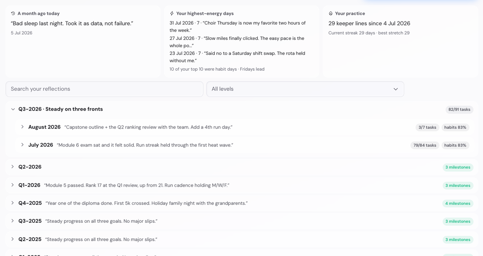
Your own words, browsable and searchable.
Your yearly goals on every planning screen: the Goal Plan
The quarter, month, week and day screens carry a Goal Plan button next to the period switcher. It opens each annual goal in full: the Summit Goal above it, the goal with its Targets, every milestone including the ones still ahead, and what this quarter contributes. Tick a milestone or change a number right there and it counts everywhere, exactly as on the Year screen. A Compact switch shows one goal at a time.
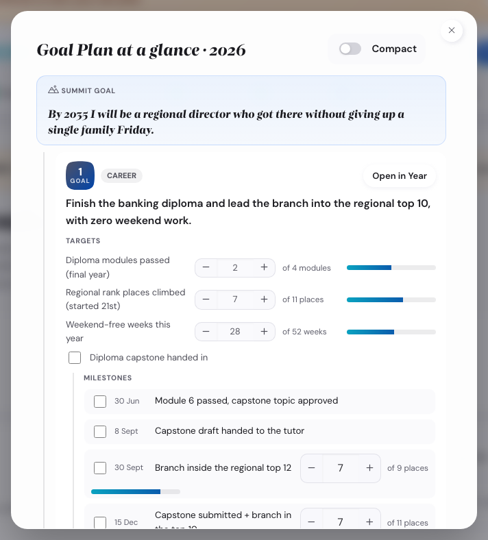
Everything belonging to one goal, one click from any screen.
Milestones tell you when it is time to start
A milestone can carry an estimated preparation time. It now speaks up when the work should begin: a week, three days and a day before, and on the day itself. The reminder names the milestone, the span you set and the due date, so a big goal stops being a surprise the week before it is due.
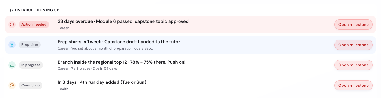
The nudge names what you set and when it is due.
Less typing while you plan
Anything with a due date now appears by itself in one Dated this month list, so nothing is typed twice and ticking it in one place ticks it everywhere. Your week starts with suggestions drawn from your own monthly priorities, greyed out until you accept them. A month that starts on a weekday is planned in the week it begins, and locking a month lands you in that week, ready to go.
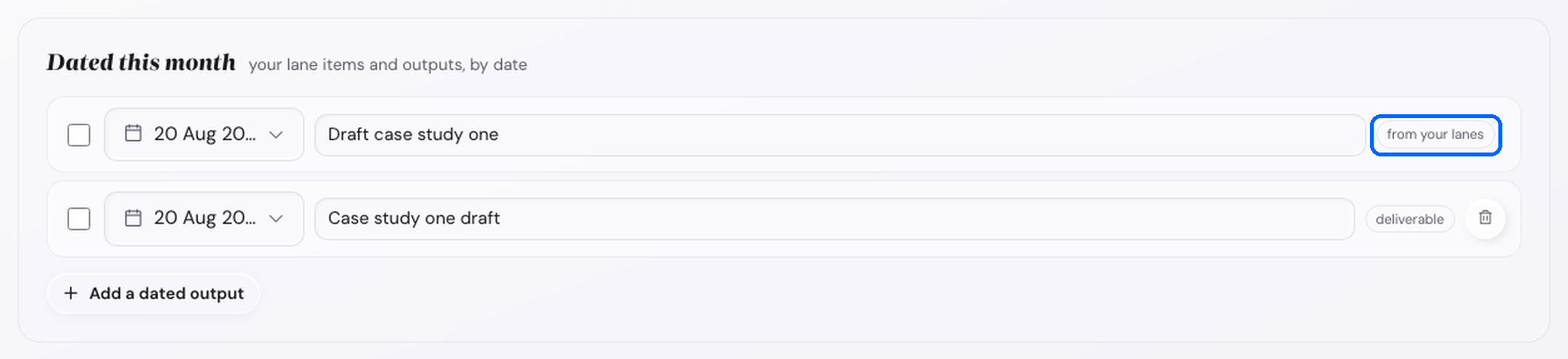
One list, filled from what you already planned.
Your month review asks about the obstacles you planned for
When you set a goal you also name what could stop you, and write a counter-move for each. Until now the app kept those and rarely brought them back. The month check-in now asks about the ones attached to goals that actually moved: did it happen? If it did, it asks whether your counter-move held, and you can add a line. Two taps, no score, and an obstacle that keeps not happening stops being asked about every month.
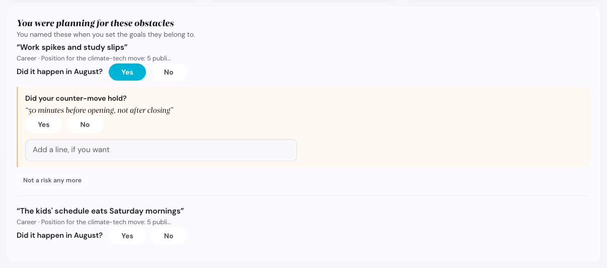
Your own words, checked at the cadence where you still remember the answer.
The reviews were rebuilt around four questions
Day, week, month, quarter and year now answer the same four questions in the same order: what happened, how it went, what you learned, what is next. Every section carries one line saying what it is for, and milestones appear exactly once per review, in a single block with everything you need: mark it achieved, update the number, move the date, and say whether it is on track, at risk, or off track. The quarter check-in now shows each yearly goal with where it stands and asks for your call; the annual wrap-up shows each goal against the Summit Goal it serves and lets you close it properly.
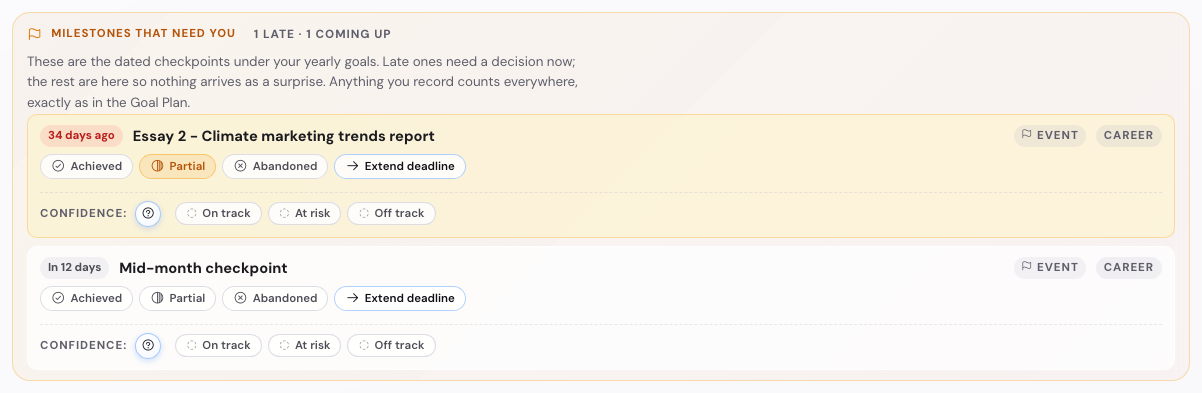
One milestone surface per review, controls included.
Each review now asks only about its own period: the week shows the week's checkpoints, the month its month, the quarter its quarter, late ones always. The day reflection shows none; if something is late, one quiet line opens a small overlay where you handle it in place. The quarter theme takes an answer now (It held / Partly / It drifted), remembered for the annual wrap-up.
Numbers move where you are, and finishing asks instead of assuming
Hold any plus or minus button and the step grows, so a money-sized number fills in seconds. Point a task at one of your numbers (the pays-into list now offers them directly, with where each stands) and ticking the task counts: plus one run, plus 200 saved; unticking takes it back exactly. And when a number reaches its target, the milestone asks whether to mark it achieved instead of deciding for you. Finished early? It offers a stretch target on top of what you achieved; the achievement stays in the record and the stretch is never graded.
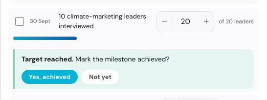
Reaching a target is a question, not a verdict. A typo can never finish a milestone.
Everything else in this update
- Fixed: checkpoints you could never have met. Drafted checkpoints used to land on fixed dates whatever day you arrived, so a new plan could open with something already overdue. They now land where there is real room to work, and impossible ones are cleared. Anything you renamed or re-dated yourself stays as it is.
- Clearer wording throughout. Over a hundred labels, buttons and messages were rewritten in plain words. What was called Success Measures is now simply Targets.
- Numbers that agree with each other. The statistics in Insights were audited one by one: every rate matches the chart beside it, and a stretch with no data says "-" instead of 0%.
- A daily value anchor. One of your top five values is named each day with a way to bring it into it, and the evening reflection closes it with one tick.
- Your groundwork follows you to the Summit Goals screen: purpose, future picture, focus areas and strengths in one strip while you write the big goals.
- A simpler first run. The welcome tour asks your name on its first page, locked steps say what unlocks them, and the cadence settings moved into Settings where you would look for them.
- Three annual goals by default, because focus beats volume. The cap is yours to raise in Settings.
- A backup reminder with a snooze, and renaming a life area now keeps its goals, milestones and Summit Goal attached.
- Dark mode covers every corner. Overlays follow your theme from the first moment, and the low-contrast spots (the locked screen's title, the demo banner, backup reminders) are readable now.
- Phone navigation says where it goes. The year-to-day switcher shows its labels on small screens instead of five identical dots, and the settings tabs show their names wherever there is room.
- Layout and readability tidied throughout for a more consistent experience, including clearer figures in statistics and dates, and controls that stay where you expect them on small screens.
Earlier versions
19 July 2026
Every step now guides you with clear tabs, planning a quarter starts with a named theme, planning and reviewing sit apart, and the year closes the loop into the next one.
- Numbered tabs on every discovery and planning step. Values, Strengths, Purpose, Life Areas, Vision, and Goals each open as a short row of numbered tabs at the top, so a long step is broken into clear stages you move through in order.
- A "Where this leads" tab on each of those steps. The last tab shows, in your own words and picks, how that step feeds the later ones. Every row carries a status tag (Done, Up next, or Comes later) and a jump link, so you can see what your choices have already set in motion.
- A clear headline on every tab. Each tab opens with a headline set in the app's own serif voice, followed by one line on what to do there and why it matters, so you are never guessing what a screen is for.
- Planning and reviewing now sit on separate tabs. In Execute, each cadence splits in two (the Quarter into three): Year into Annual goals and Annual wrap-up; Quarter into Slice the year, Monthly priorities, and Check-in; Month, Week, and Today each into a Plan tab and their review. You plan first and review later, without the two crowding one screen.
- The review opens when the plan is locked. A period's wrap-up, check-in, or reflection stays closed until you lock that period's plan, so you are not asked to review something you have not planned yet.
- Planning a quarter now starts with a theme. The quarter opens by naming itself: a short theme name and one sentence for what the quarter looks like at its best, with a second theme if you need one. The theme rides along the top while you plan, and your Quarter check-in opens by reading it back and asking whether the quarter served it.
- The quarter plan walks five numbered steps. Name the quarter, break each annual goal into its slice, set this quarter's numbers, place your months, then check in. The step numbers carry on across the tabs, so you always know where you are in the quarter.
- Committing a goal to the quarter is one tick. On the Slice the year tab, ticking a milestone commits it, with no separate step to push it into a month. A goal you count, like three long runs, splits across the three months in a small control that starts even and you can adjust, so 1-0-2 is a click away if that fits your quarter.
- Each month now sorts into three lanes. On the Monthly priorities tab, everything you committed waits in a tray, and you place it: a main focus of up to two, with lighter stretch slots for when a month goes well and a control to allow a third when a third genuinely is the point; the milestones due that month; and small goals you keep ticking underneath. A full month never drops what you place, since it lands as a stretch slot or stays visible in the tray.
- Check-ins read each lane on its own terms. Your main focus asks whether it moved, each milestone is marked met or you move its date, and small goals show a simple done count. The Month plan mirrors the same three lanes, with its main focus carried in from the quarter.
- Three tabs inside each annual goal. Every annual goal card now holds The goal, Friction Map, and Milestones as small tabs, so the goal sentence, your obstacle plan, and your milestones each get their own clean space.
- The year closes the loop. The Annual wrap-up ends with a short fit-check that walks you back through your values and Summit Goals, then a "Start the next climb" handoff carries you into the new year.
- Carry the climb forward into a new year. Open a fresh year that only holds untouched drafts and you are met with your Summit Goal per priority area, last year's win in that area (or an honest note when there was not one), and one question: what will move you toward this summit this year?
- A clear next step at the bottom of every step. Each planning tab and each annual goal card now ends with one obvious next move instead of a dead end. On the quarter it reads "Place your months" once you have committed, and "Open the month plan" once the quarter is wrapped. Inside a goal it walks you from The goal to Friction Map to Milestones and on to the next goal. Clicking a next step scrolls you up to the top of whatever it opened.
- The year offers to wrap when it is winding down. Once your annual plan is locked and the calendar reaches December or January, the Annual goals tab ends with a gentle Annual wrap-up step, so closing the year is one clear move when the time is right.
- Tidier tabs on phones. On a small screen the tab strips show the tabs you are not on as plain numbers and spell out only the one you are reading, so the row always fits.
18 July 2026
Your plan now coaches you with your own words: see where each choice lands, plan smarter for obstacles, and design for the bad week.
- A sharper strengths profile, if you want it. After the word-cloud rounds, an optional "Sharpen your profile" pass adds 20 short questions (about 3 minutes, from public-domain research items) for more precise dimension scores. The words you picked stay your named strengths. If a dimension has too few picks to read, the app says so plainly instead of guessing.
- A smarter Friction Map on your goals. When you plan a goal's obstacles, you now sort each one by whether it is in your control and whether it keeps coming back, and the app points you to the counter-move that fits: an if-then plan, a change to your setup, or a Plan B trigger for what you cannot change. Your Life Areas notes on external factors show up right there to help you sort.
- Back a plan with your own strengths. Any if-then response can carry a "Leaning on" line: a signature strength that backs your comeback. The app suggests a pairing and you can always change it. Your Summit Goals gain a matching lean-on and watch-out line once your strengths are in.
- The Comeback rule for habits. The habit layer now leads with one idea: protect the comeback, not the streak. On a hard day, drop to your lazy-day version, a two-minute fallback you set in advance, and your streak holds with an amber tick. A full day right after a lazy one fires a comeback badge. If a day goes fully empty the streak resets, and the move is the same: come back the very next day, even tiny. Builds on the never-miss-twice idea.
- Your alternate plans stay useful. If several weeks close heavy on goals under your active plan, the coach offers your other plans for a side-by-side re-read instead of telling you to push harder. A re-read resets the signal; a quiet "Not now" rests it for two weeks.
- A third lens on your Life Areas. Alongside the External factors note, you can mark whether a gap is mostly yours to move, mixed, or mostly context. Areas you mark as mostly context steer their goals toward how you respond, not toward forcing an outcome you do not control.
- A one-line weekly win. The Full system's weekly reflection gains an optional "One win this week" line. Note a single win in about two minutes and it lands as a card on your Wall of Wins. It stays hidden in the Essentials lens.
17 July 2026
Know your strengths, read your Life Areas at a glance, and take your whole plan with you as one PDF.
- New: a strengths check. An optional step between Values and Purpose. Pick the 5 words most like you from a word cloud (it reshuffles every 20 seconds to keep your first instincts honest; a "No time pressure" switch turns that off), then your 3 watch-outs. You get a profile on 5 science-grounded dimensions (built on the public-domain IPIP Big Five) topped by a headline archetype, one this-week action per strength, and an editable "If [obstacle], then I will [action]" plan per watch-out. Skip it or revisit it any time; what you find feeds your Purpose step, your Summit Goals, your habit suggestions, and your week plan.
- The save pill explains itself. The pill at the bottom right now reads "All changes saved on this device". Click it for "What gets saved?": a plain list of what is stored and where, a "Last saved" line, and the backup-file download. Downloading a backup now confirms on the pill instead of a popup.
- A clearer Life Areas Map. Satisfaction (blue) and importance (pink) are now color-coded on the wheel, the sliders, and the value chips, with the importance line drawn as a clear pink outline. The area names around the wheel are now buttons: hover shows a pill outline, click opens that area. Each area's detail gains an "External factors" prompt (what is in your control, and what is context you adapt to), and Environment's description now centers on the spaces you can shape.
- Download your plan as one PDF. More menu → "Download plan as PDF": choose the sections you want (values card, year, quarter, month, week, and day plans, Habit Garden, Wall of Wins) and a date range (current period; this week, month, quarter, or year; or custom dates), see a size estimate, then save through your browser's print dialog. The button on each screen is now called "Print / Save PDF".
- A gentle backup reminder. Every fifth plan you lock without a recent backup file, a small toast offers a one-tap backup download.
- Theme polish. Smoother background gradients on all 33 themes in both light and dark mode, with no more visible color banding. Dark mode primary buttons now use white text on deeper button colors, four neon themes got readable light-mode accents, and the settings tabs fit on one row.
- A refreshed demo. Maya, the sample user, is now a bank branch manager with a believable year: a part-time banking diploma, a push into the regional top 10 without weekend work, a first 10k, family nights, and choir.
3 July 2026
A gentler first hour, and your discoveries become keepsakes.
- Start with the essentials. New users now begin with a focused version of the app: one Summit Goal and one annual goal to start, one vision composer, and the extra options folded neatly away. The full system is one tap away the whole time, from the switch next to the menu, in the welcome, or in Settings. Your data is identical in both views, so you can switch back and forth any time and nothing is ever lost. Existing users keep the full system exactly as it is.
- Your discoveries become cards you can keep. Finishing your values, your purpose statement, or your life areas map now produces a beautiful card you can save as an image or share. Your values card, your purpose card, your life balance wheel: real results, worth keeping.
- Choosing your focus is now a win. When you map your life areas and pick the two to focus on, that decision lands on your Wall of Wins as a "Compass set" card, with your balance map exactly as it looked on the day you decided. Your Wall starts filling in from your very first session.
- Honest time promises. The welcome now describes the real shape of the journey: three short sittings of about 20 minutes each, with clear good-stopping-points along the way. Everything saves as you go.
1 July 2026
The Habit Library now covers all ten life areas.
- 250 ready-made habits to start from. When you add a habit you can now pick from a curated library that spans every life area: Physical Health, Emotional Wellbeing, Relationships, Career, Financial, Growth and Learning, Fun and Recreation, Purpose and Meaning, Environment, and Contribution. Twenty-five starting points per area, and you can still start blank whenever you prefer.
- Each one is a real, well-formed habit. Every preset comes with an identity line, a trigger, a reason why, a reward and an easier lazy-day version for busy days. Many include three intensity levels so you can start gentle and build up, and some suggest a habit that pairs well with it.
30 June 2026
A big polish pass after a full design and usability review, plus a step-by-step run through the whole program on desktop and phone. Lots of small things that add up to a smoother first hour.
- Clearer start. After you type your name, "Continue" is now an obvious filled button instead of looking like a plain link. When the box is empty it reads "Skip for now", so adding your name feels like the main path. If you mistype it, the first intro slide now has an "Edit name" button to fix it on the spot.
- The Vision prompts are open by default. The five short sensory prompts that make your vision vivid now show straight away, with the free-form paragraph still there as an alternative.
- Annual goals show all your areas. When you add an annual goal, every life area now appears in three clear tiers: the one with a Summit Goal, your other priority areas, and the rest. Your priorities are never hidden. Adding a Summit Goal for an area is clearly optional and links to the right step.
- One-click clear on Summit Goals. Picked an example and changed your mind? A "Clear selection" button resets the card instantly. The "add a goal for another priority area" button now stands out so you do not skip past your other areas.
- Safer deletes. Every remove, clear and delete confirmation is now clearly red, so a permanent action is obvious, and each one tells you what you can get back.
- Little explanations where you need them. The Life Areas priority score has a plain-language tooltip, the habit squares explain how to cycle them by tapping, and habit stats now have distinct icons (streak, longest streak, total days).
- Undo sticks around. On the Values ranking step, "Undo last move" no longer vanishes after a few seconds. Weekly effort options now read Small, Medium and Large instead of single letters.
- Phone fixes. The habit year grid keeps the month names pinned on the left while you scroll across the days. The reminder-calendar event count no longer sits on top of the form. Short labels like "4 of 4" and the day's anchor stay on one line, and completed steps show their names so you can tap back to them.
- Fixes. The reminder-calendar help link now opens the real Help page instead of the homepage. The Life Areas wheel no longer clips long labels like "Purpose & Meaning". The Summit Goal text is tappable to edit on phones.
- Toasts wait their turn. The small confirmation messages no longer pop up behind the welcome screen or a dialog. They wait until the view is clear, then appear.
- A cleaner name prompt. The button on the "What should I call you?" screen is now a proper button: a quiet "Skip for now" until you type, and a solid "Continue" once you do.
10 June 2026
- Print now makes a real printable. The Print / PDF button builds a clean paper layout from your data instead of printing the screen: daily, weekly, month, quarter and year plan sheets, a habit year grid (one page per habit), the Wall of Wins as a keepsake, and a frameable Values card. Every page carries a small Goals & Progress watermark.
- Start with habits if you want. The Habits step normally unlocks after your first week plan. Tapping it while locked now offers "Start with habits instead", which opens the Habit Garden right away. The full cascade stays available.
- Two new badges. "First 3-day streak" lands the first time any habit's streak reaches 3 days; "The comeback" lands when you mark a habit done the day right after a lazy day. Both become cards on your Wall of Wins, which joins the stepper with your first achievement.
- Reflections now ask what you learned. The daily reflection has an always-there, optional "One thing I learned today" line, and the weekly reflection shows its Key learnings card in both Light and Full modes.
- The reminder-calendar setup no longer interrupts. After you set your Summit Goals, a small toast invites you to set up the reminder calendar instead of the wizard opening by itself. The wizard stays one tap away under Settings → Reminders.
- Clearer bottom-bar guidance. The Continue button now names the actual next step (Life Areas, Summit Goals, the Week plan, Today) and no longer sticks in a disabled state while you type.
- Plan locks are guarded. The lock button is disabled or asks you to confirm when a plan is still empty, so you cannot lock an empty year by accident.
- Naming cleanups. The unlock screen now says "Beta password", the end-of-day section is titled "Daily Reflection", and goal measures are consistently called "Success Measures".
4 June 2026
- Welcome screen now fits phones. The password box is full-width, and the intro text no longer runs off the side.
- The feedback prompt is now a clean rounded bar instead of an odd oval shape.
- Daily priorities line up consistently on phones: the tick box sits on the left, and the hours box no longer cuts off the number.
- Evened out the spacing inside cards on phones so elements are not cramped against the edges.
- Tap to expand long entries on phones. Tapping a long task or goal title opens it as a full, multi-line view so you can read and edit the whole thing. Tap away or press Enter to save, Escape to cancel.
- Clearer plan buttons. The button that confirms each plan now reads "Lock today's plan" (and this week's, this month's, this quarter's, this year's), so it is obvious it locks in your plan rather than starting something new.
- Wider cards on phones. Trimmed the outer page margins on the planning screens so your tasks, notes and other cards use noticeably more of the screen width.
- The "Give feedback" button in the feedback prompt now opens the feedback page in a new tab.
- Fixed the reminder calendar setup. Its second step ("Rhythm", where you choose which cadences to be reminded about) was blank; it now opens correctly.
- Locking a plan now moves you forward. After you lock a year, quarter, month or week plan, the app takes you straight to the next level down so you can keep planning (year to quarter to month to week to today), instead of jumping to that period's reflection or check-in.
3 June 2026
- Better on phones. Planning cards now use the full width of your screen, so there's more room to read and type.
- Fixed your daily priorities on small screens: the task, focus-area and hours fields used to overlap or run off the edge; now they stack cleanly.
- Weekly deliverables now lay out neatly on phones: the title gets its own line, with the date, effort and delete controls sitting comfortably below instead of being squashed. The effort field is now labelled (for example "Effort: M") so it is no longer a lone letter.
- The star rating on your weekly reflections and monthly check-ins no longer spills outside its card on narrow screens.
- Tidied the background behind the sample data (removed some faint diagonal lines).
The first public version · 21 May 2026
The first version anyone can try. What you can do with it:
- Plan from the top down. Your values and long-term vision flow into a yearly goal, then into quarters, months, weeks and today, so what you do today always traces back to what matters most.
- The same simple rhythm at every level. Plan it, do it, then reflect on each day and week, check in each month and quarter, and close the year with a wrap-up.
- Grow habits in the Habit Garden. Tick them off daily and watch a year-at-a-glance tracker fill in as you go.
- See how you're tracking. Insights show your momentum, and a Wall of Wins collects everything you've finished (it appears as its own step once you earn your first achievement).
- Goals that go up or down. Aim higher (run more) or lower (spend less); both kinds are tracked.
- Make it yours. 26 colour themes, each with a light and a dark mode.
- Your data stays with you. Everything lives in your browser. Save a backup file whenever you like, or connect Dropbox to sync across devices.
- Try before you type. Load one-tap sample data to explore the whole app, then start fresh with your own.