Every UI surface in the app
Open the app and count what is on the screen: a topbar, a stepper, a body, an onboarding bar at the bottom, sometimes a banner, sometimes an amber dot pulsing on a step you have not visited in a while. That is the whole vocabulary. Eleven surfaces, each one doing one job. If you have ever wondered "what is this thing" while clicking around, this is the page to scan. Cropped screenshots throughout, plain language, no jargon you have not seen before.
Contents
- The password gate
- Topbar · brand, status, Feedback, Save, Load, More
- Stepper · the cascade nav
- Onboarding bar · the contextual bottom bar
- Upstream-change ripple · the amber dot
- Command palette · Ctrl/Cmd+K jump bar
- More menu dropdown
- Banners · sunset, save reminder, browser warning
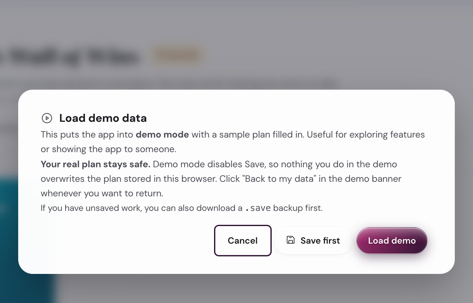
- Modals · load demo, about, Quarter Check-in, settings
- Empty states
- Dark mode
About the persona names below. Only Maya is loadable as a demo inside the app (More menu → Load demo data). David, Sara, Alex, Priya, and Tom are illustrative scenarios from the Scenarios page: they show how different people use each surface. None of them is a loadable demo persona.
1. The password gate
What you see first
Before unlockEvery visit to the app starts here (in the beta). A single input field labelled Beta password, a soft cream background, an Unlock button. The app remembers you for the browser session, so after the first unlock the gate stays away until you close the tab.
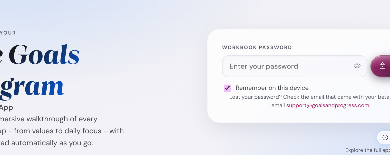
Wrong password shows a soft inline error. The error text on the first miss is gentler than on subsequent misses (a small UX hint that you may have mistyped). Caps Lock on shows a separate hint. The password is hashed (SHA-256) in your browser; it never leaves your device.
Lost the password? It is in the welcome email from Goals and Progress; otherwise email support@goalsandprogress.com. There is no in-app reset. Once you have it back, paste, unlock, done.
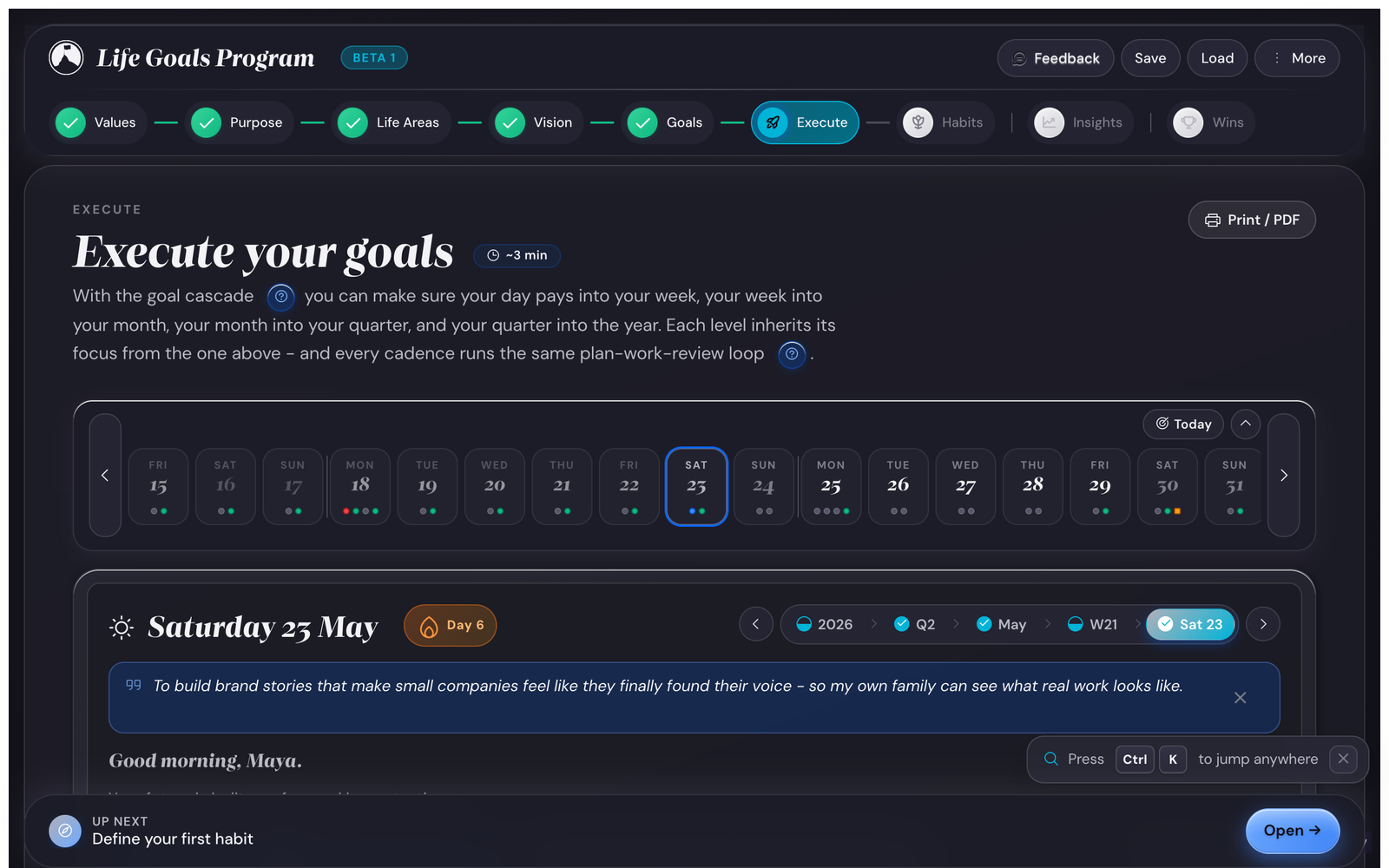
2. Topbar
The control strip at the top
Always visibleThe topbar carries the brand mark, a Beta-1 chip (tap to open About), the version chip (tap to open What's New), and four action buttons: Feedback (opens Senja in a new tab), Save (downloads a .save backup), Load (reads a .save file from disk), and More (the dropdown menu with everything else).
The save status itself lives in a small floating pill at the bottom-right of the screen, NOT in the topbar (moved 2026-05-22 to free up topbar space). Click the pill to manually trigger a save.

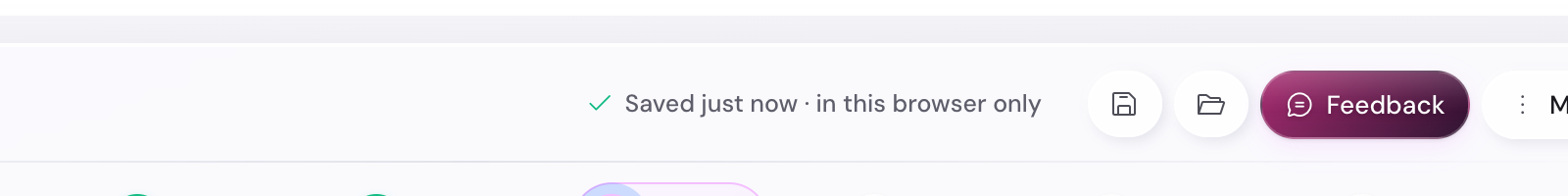
How the personas use the topbar. Maya leaves Dropbox sync on; her status reads "Synced to Dropbox." David saves manually before every long run weekend (just in case). Sara uses Feedback most often; she has the highest bug-find rate in the beta cohort.
What the version chip opens
The small version label next to the brand (e.g. "v1.0-beta.1") opens the What's New modal. It shows what changed since your last visit: features added, fixes shipped, known issues. The modal also fires automatically once per release when you open the app on a new build, so you do not have to remember to check. Tap "Got it" to dismiss; tap "Read full changelog" to open the Changelog page in a new tab.
3. Stepper
The cascade nav
Always visible (below the topbar)The stepper is the spine of the app. Eight pills: Values, Purpose, Life Areas, Vision, Goals, Execute, Habits, Insights. A ninth, Wins (the Wall of Wins), joins the row on its own once you have earned your first achievement. Tap any pill to jump to that step. Completed steps show a green check; the active step is filled.


The stepper scrolls horizontally on narrow screens; arrow keys (← / →) navigate between steps when the stepper is focused. Each pill also has a tooltip showing the step's full name.
4. Onboarding bar (ob-bar)
The contextual bottom bar
Bottom of screen, always visibleThe ob-bar is the bottom strip that tells you what is next. It carries: an avatar (a compass for general nav, an attention mark for amber states), an eyebrow + label (the "UP NEXT · Define your first habit" pair), and a primary action button (Open, You are here, Review N).
During discovery (before Summit Goals exist) the ob-bar tracks setup progress. After Summits, it shifts to cadence-aware mode: showing the next cadence event due.
When upstream changes have stale-flagged downstream steps, the ob-bar grows an amber "Review N" chip that opens a slide-out panel listing the flagged steps with jump links.
"You are here" state. If the ob-bar points to the step you are already on, the button disables and reads "You are here" instead of "Open." Prevents the loop of clicking a button that jumps you nowhere.
5. Upstream-change ripple
The amber dot system
Three places at onceWhen you change something upstream (Values, Life Areas) after downstream steps already have content, the app flags every downstream step that may be out of sync. The flag shows in three places at the same time:
- An amber pulsing dot on the stepper pill for each flagged step.
- An amber "Review N" chip on the ob-bar.
- An on-page infobox at the top of each flagged step ("You changed your Life Areas. Re-read your Vision and decide if it still fits."). Two buttons: Re-read (jumps to the upstream) or Still fits, dismiss.
The three places together form a clear breadcrumb back to what changed. Dismissing the infobox on a step clears the amber dot on that step; clearing all the dots also clears the ob-bar chip.
How the personas use it. Tom re-shaped his Life Areas in month 3 (Career came back from "not a focus"). The ripple flagged Summit Goals + Execute. He spent 20 min over a weekend re-reading + dismissing.
6. Command palette · Ctrl/Cmd+K jump bar
Fast keyboard navigation
From anywherePress Cmd+K (Mac) or Ctrl+K (Windows / Linux) from anywhere in the app. A search overlay appears in the center of the screen.
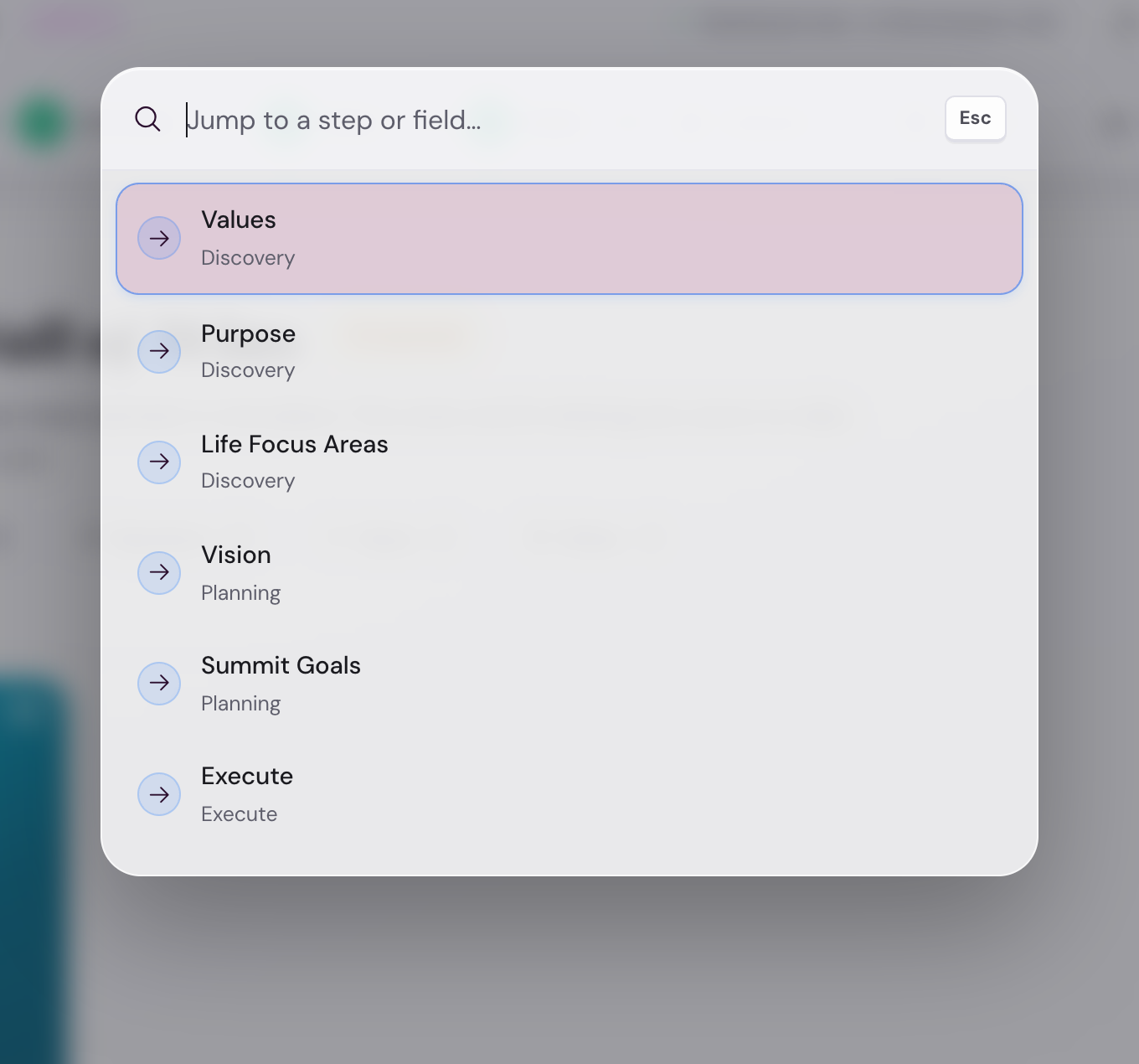
Type any step name or partial. Hit Enter to jump. The palette closes on selection or on Escape.
Power users. Alex (sabbatical year, all-day usage) lives in the palette. Day reflection in 30 seconds: Cmd+K, type "day," Enter, check off habits, close.
7. More menu dropdown
Everything else lives here
Topbar → More (three-dot button)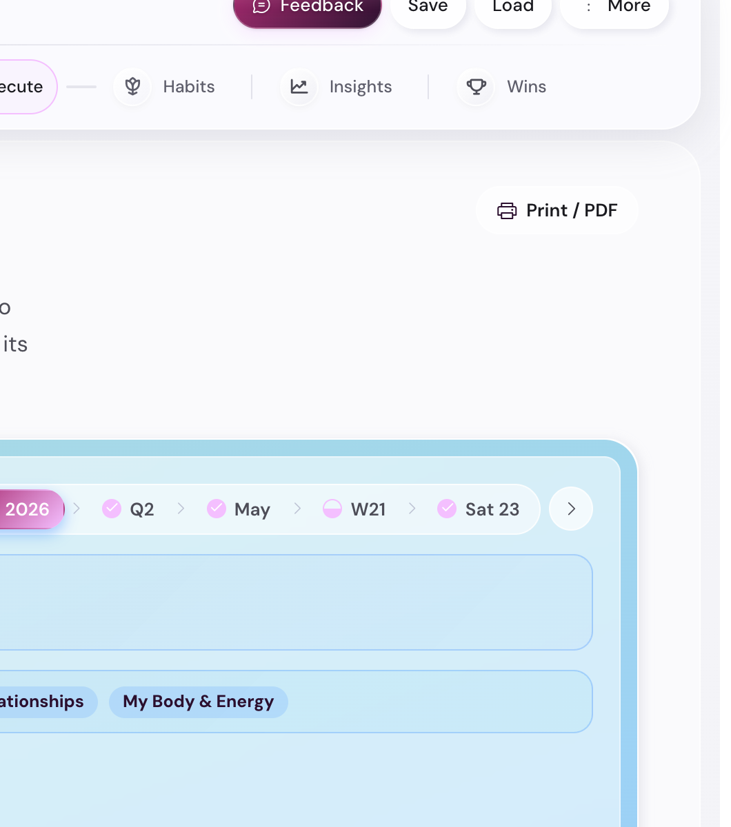
Items in the menu:
- Settings: opens the 6-tab Settings modal.
- Load demo data: switches the app to a fully-populated 3-year demo plan.
- Replay intro: re-opens the 4-page welcome carousel. Useful if you skipped it on the first launch or want to revisit the methodology summary. Does not reset any data.
- Beginners guide: opens this guide in a new tab.
- About: a short modal explaining what the app is + the team.
- Help: opens the help reference in a new tab.
- Changelog: opens the changelog in a new tab.
- App privacy: opens the app-specific privacy notes in a new tab.
- App terms: opens the app-specific terms in a new tab.
- Connect Dropbox: starts the OAuth flow (or "Disconnect" if already connected).
8. Banners
The full-width strips that fire on conditions
Top of screen, dismissibleThe app uses banners sparingly for things that need your attention but should not block work:
- Demo mode banner (purple): present whenever you are in the demo. One button: "Back to my data."
- Save reminder banner (amber): fires if it has been 7+ days since your last manual save and your plan has data. Two buttons: "Save now" + "Dismiss for this session." Dismissal persists per browser session, not across reloads on a new day.
- Sunset banner (amber): fires from 30 days before the beta end-date through to the close (currently 1 August through 31 August 2026). Reminds you to download a
.savebackup before the build retires. Includes a one-click backup button. - Year-end backup banner (green, festive): fires Dec 28 through Jan 7. Reminds you to download a year-end
.savefor the archive + opens the annual wrap-up prompt. Single-fire per year (dismissible). - Storage-quota banner (graded: amber at 2 MB / amber-stronger at 3.5 MB / red at 4.5 MB): fires when your
.saveapproaches the localStorage quota for the browser. Suggests connecting Dropbox or trimming the Wall of Wins / archived habits. Browser localStorage caps vary (usually 5-10 MB). - Bridge banner (purple, transient): fires for ~6 seconds between consecutive forward step transitions during the first session. Confirms "Step N saved, moving to Step N+1." Suppresses after the first session ends.
- Browser-support warning (red): fires if your browser does not support a critical feature (e.g., color-mix in OKLCH). The app still works; some visual polish breaks.

9. Modals
The dialog overlays
Focus-trapped, Escape-closableModals always cover the app surface; they trap keyboard focus while open; Escape closes them. The app uses modals for actions that warrant a pause:
- Load demo confirmation: protects your real plan before swapping in the demo.
- About modal: a short explainer + credits + version chip.
- Quarter Check-in poster: the 4-card recap fired at end of quarter. Has a "save as image" button.
- Settings modal: 6 tabs for every preference.
- Welcome carousel: a 4-page intro shown on the very first launch. Pages cover the welcome, the methodology, privacy, and a "ready to start" prompt. Dismiss with Skip or by tapping outside; the dots show progress. The flag
lgp-welcome-seenhides it on subsequent launches. Re-open it from More menu → Replay intro. - Beta-welcome modal: a separate, beta-specific modal that ALSO fires on first launch, after the welcome carousel. It explains what beta means (free, time-limited, expects feedback), links to the beta T&C, and asks you to accept before continuing. Hidden via the
lgp-pv4-beta-ackflag once accepted. Different modal, different purpose. The welcome carousel teaches the app; the beta-welcome modal accepts the beta agreement. - Milestone-peek modal: opens when you tap a milestone in the timeline dropdown or the year-overview cards. Shows the milestone's KPI target, current value, notes, and three grade buttons (Achieved / Partial / Abandoned). Grading from here saves to the cascade without a navigation. Two secondary links jump to the month plan or the goal card if you want deeper context. Closes with Escape, the X button, or clicking outside.
- Backup-reminder modal: in the rare case the save banner is dismissed too many times.
10. Empty states
What new users see before any data exists
First-launch / pre-dataBefore you have entered anything, the steps render with empty-state hints instead of content. Each one explains what will appear and how to add it. Empty states are warm, not blank-page-anxiety-triggering.


11. Dark mode
An honest dark mode for late-evening reflections
33 palettes × light or darkEvery one of the 33 palettes has a dark variant. The default dark palette is Brushed Steel (cool grey, no mesh gradient). The dark variant is true-dark (near-black background, contrast-checked text), not just a tinted overlay.
Switch via Settings → Appearance → Mode toggle, or via the small theme swatch in the topbar. The change is immediate and persists across sessions.
Print and save-as-PDF (the small button you might miss)
Every step has a Print/PDF button
Top-right of every stepThe small printer icon in the top-right of each step (tooltip: "Print or save this view as a clean PDF") does not print the screen. It builds a purpose-made paper layout from your data, then opens the print dialog; the browser's "Save as PDF" option gives you a file instead of paper. Each major view has its own layout:
- Daily, weekly, month, quarter, and year plans print as checklist-style sheets: priorities with checkbox squares, deliverables, milestone tables with Traffic Light dots, and the matching reflection or check-in prompts.
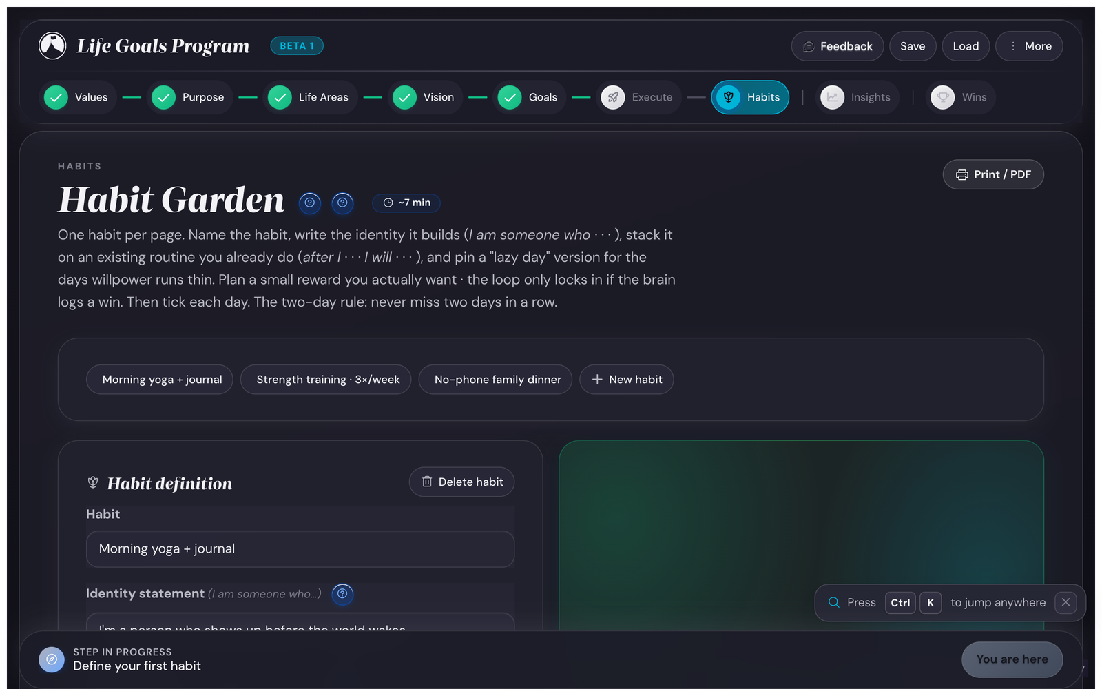
- The Habit Garden prints a year grid, one page per habit, with the identity line, Trigger / Reward / Lazy-day facts, and streak stats.
- The Wall of Wins prints as a chronological keepsake grouped by year.
- Values prints a frameable card: your top 5 ranked values plus your purpose statement, large and centered.
Useful for a Quarter check-in on paper, sharing your plan with a partner or coach without giving them app access, or printing the Wall of Wins for the year archive. Steps without a custom layout (Purpose, Life Areas, Vision, Insights) fall back to a clean reskin of the screen with the chrome hidden.
Every page carries a small Goals & Progress watermark (the circular logo plus the wordmark) in the footer. Empty fields print as ruled lines you can fill in by hand, never as blanks or errors.
Tip. The printout is always white paper with near-black ink, whatever theme you use on screen, so dark mode does not waste toner.
Surfaces you will never need to touch
For completeness, here are surfaces that exist in the app but you almost never interact with directly:
- Service worker registration. Runs automatically. Caches the app shell offline.
- Manifest.json. Tells the browser the app is installable as a PWA.
- Service Worker cache version. Bumps with each deploy; forces the shell cache to refresh so you always see the latest version.
Where to next
- Ready to use these surfaces? Open the app and try the 10-minute quick start.
- Want to know what each setting does? Open the Settings page.
- Have a specific question? Browse the How do I… recipes.